
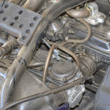
This picture shows where the front brake line that comes down from the handlebar gets split to go to the two front disk brakes.
I got to wondering, "Could I make money taking pictures as illustrations for service manuals?" So I looked at some service manuals. The first thing I noticed is that my pictures would have to be black and white. I can do that.

Converting to B&W is easy enough.
Even in B&W, though, my picture didn't match the quality of those in the typical manual. So next I tried reducing the contrast and compensating for that by making the picture too bright.

A little less contrast, a little more brightness.
That still didn't do enough, though, so I threw in a little graininess.

The graininess is subtle, but it has a noticeable effect on the amount of eye strain felt when trying to pick out details in the photo.
I had come a long way, but it seemed that I still had a long way to go. I wracked my brain trying to figure out what I was missing. Then, in a forehead smacking moment of insight, I realized what I was doing wrong. My picture was much too big. So I tried scaling it down to a better size, then threw in another dose of graininess (you can never have too much graininess in a service manual illustration), and voila.

Now we're talkin'!
I think I'm ready.
 |
| Concours_2009_08_08 |
P.S. This post is not intended to poke fun at Kawasaki service manuals. I don't think I've ever even seen a Kawasaki service manual. It's just about service manuals in general, which seem to be designed to frustrate rather than assist.


No comments:
Post a Comment